


Brighter / Cigna
Bridging the gap between design and engineering.
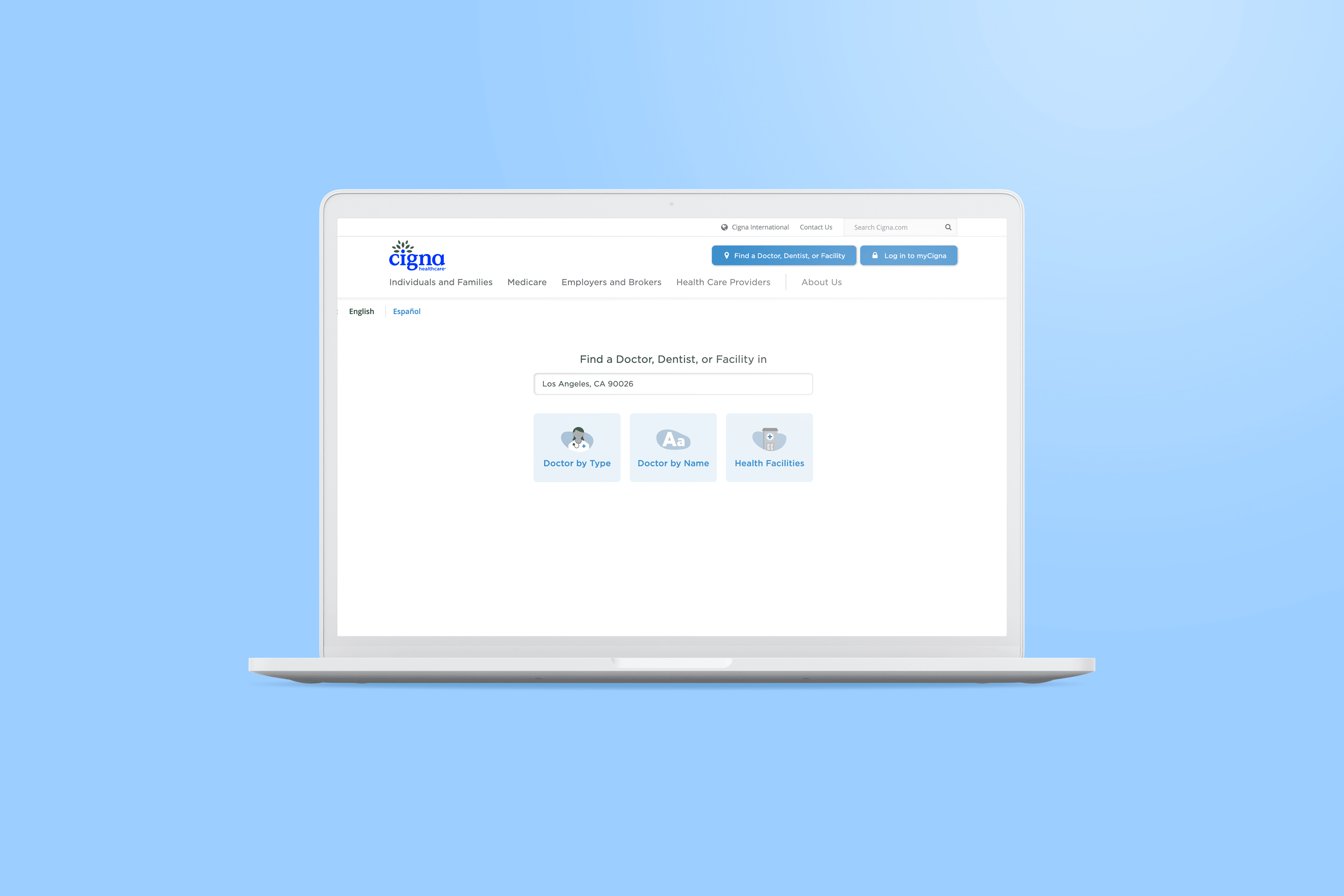
Brighter was a digital healthcare startup building tools to help people find, evaluate, schedule, and review dental providers.
I joined the team as a Frontend Developer, initially focusing on HTML and CSS.
Over several years, my role evolved into a hybrid of development and design — helping UI/UX teams convey major needs and decisions with engineers.
After Brighter was acquired by Cigna, my work expanded to an overhaul of the company’s search experience.
During my time at Cigna, I played a leading role in navigating responsive layout and accessibility between multiple teams.
ROLE
Design Engineering · Front-End Development · UX Collaboration · Responsive Design · Accessibility
TEAM
Designers · Engineers · Product · QA · Cigna API Team
TIMELINE
2016–2020
TOOLS
Angular · JavaScript · HTML · CSS · SCSS · Git · Lighthouse · BrowserStack · WCAG · Section 508
MY CHALLENGE:
How do you keep multiple teams in sync when a project grows in complexity and has multiple needs?

I Problem
Healthcare information is complicated. Implementation and design shouldn’t be.
Working with healthcare data — whether a robust dental network like Brighter, or millions of providers through Cigna — means teams need to stay in lock step.
But teams think about problems differently:
Product may want to gather the most pertinent information from users.
Design may focus on readability and reducing information overload for users.
Engineers may want to standardize and componetize across a humongous application.
And healthcare, like government, is compliance driven; applications must work across devices, browsers, and users with a variety of accessibility needs.
When I joined Brighter, a Santa Monica-based startup, I quickly found myself working across disciplines to coordinate these needs.
Even as I contributed to a complex code base with fellow engineers, my speciality became about helping various perspectives meet in the middle.


II Process
01. Learn the limitations of the medium
What if submitting a claim were as simple as taking a photo?
Before thinking about every edge case, I envisioned the best possible scenario for one user.
When designs depended on something an older client couldn't support, I explained the limitation before it reached the engineering process.
02. ANticipate Complexity
But wait — one can’t simply snap their fingers and submit a form!
Without much added complexity, however, we can get pretty close.
03. CONSIDER REAL LIFE use-cases
Given our ideal submission flow and the realties of claims submission, how do we stack complexity?
To answer this, I broke the product into THREE increasingly complex use cases:

A — Receipts
Receipts are simple.
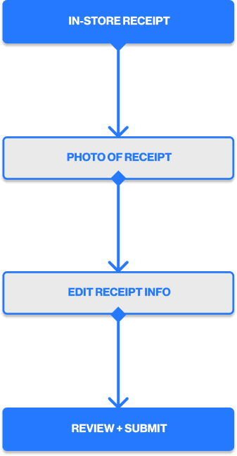
Using the four-step flow, a user can snap one photo of an itemized receipt and read a relatively predictable list of expenses. They may need to review or even edit the info, but not much else changes.
Capture Receipt → Extract Receipt Info → Review/Edit Info → Submit
B — Healthcare bills
Medical bills may seem as straightforward as receipts, but they actually introduce new complications, like:
Multiple pages
Additional receipt
Outstanding balances
C — Account information
Tangentially, users will need to fill out information that isn’t included in the document they submit to begin with. That includes information, like:
The user’s FSA administrator
Their subscriber information
Their dependent information



IV Final Thoughts
From a loosely defined idea to a working MVP.
Over roughly 3–4 months, we took FSA Simple from a loosely defined business concept to a working mobile application.
Our team:
Defined the major claim workflows
Created a complete mobile UX
Developed a working React Native application
Tested the experience with users
Submitted the application through Apple's testing process
The product ultimately never launched, but it doesn't change what the project accomplished from a product/design perspective.
We had taken an ambiguous, complicated problem and turned it into a functioning experience that could actually be used and tested.
Key Takeaways
Understand the system.
Break it into smaller pieces.
Solve the simplest valuable version first.
Introduce complexity only when it's necessary.
Build, test, and refine.
METRICS
© 2026 BEN NICHOLSON