







FSA Simple
Making a complicated reimbursement process easy.
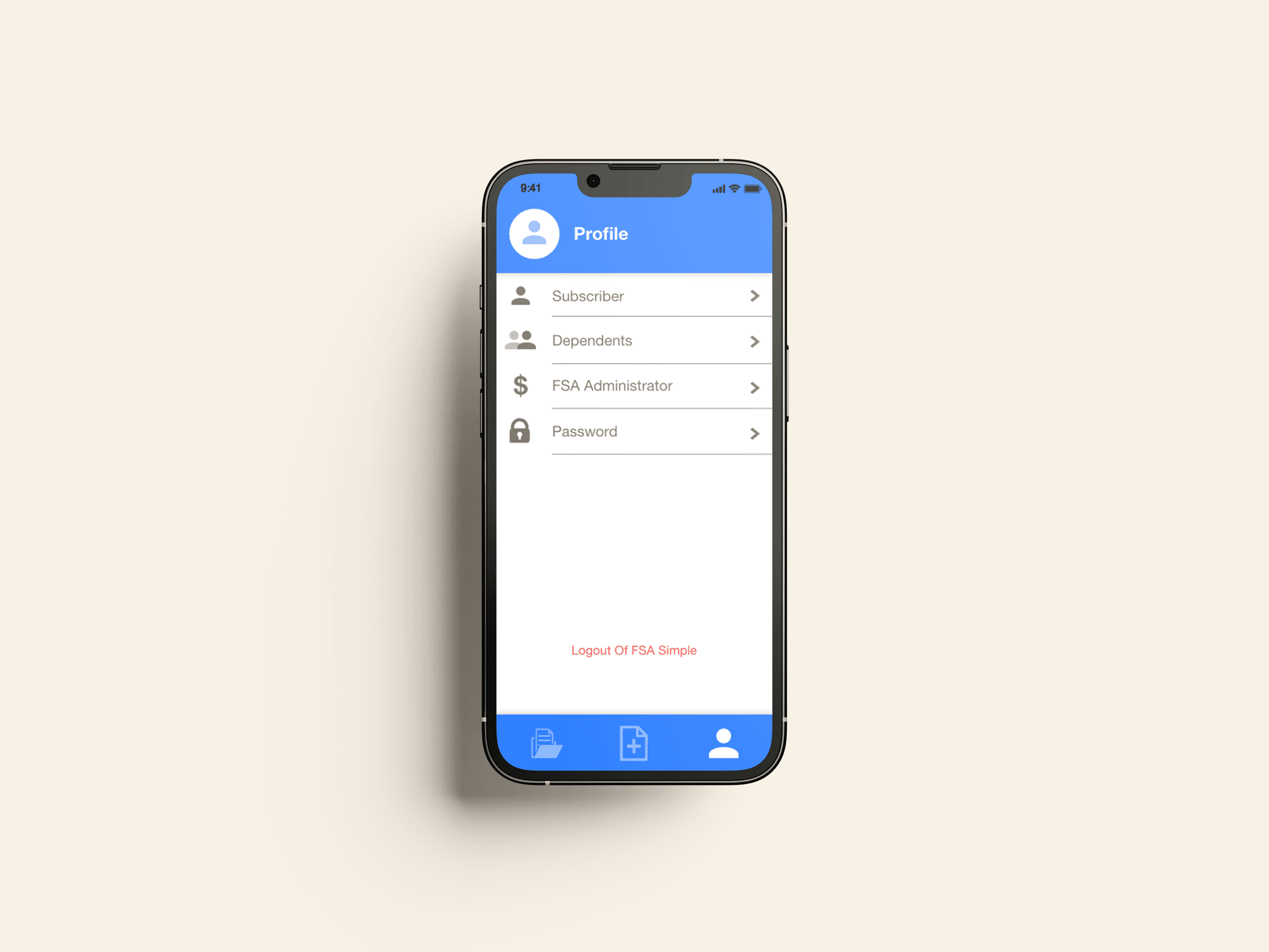
FSA Simple was a mobile app that streamlined FSA/HSA claims submissions—a notoriously onerous process. As product lead, I spearheaded UX design, working with a broad problem statement through a React Native MVP.
ROLE
Project Lead · Product Design · UX/UI · Prototyping · Front-end implementation
TEAM
2 Business Leads · UX Researcher · Developer
TIMELINE
3–4 months
TOOLS
Adobe XD · React Native · React · TypeScript · Redux
MY CHALLENGE:
How do you take a complicated, rules-heavy process and make it simple?

I Problem
FSA reimbursement is a documentation-heavy process.
A user might have a simple itemized receipt—or a multi-page medical bill that requires additional receipts, dates, payment information, subscriber information, or other documentation.
Worse, the consequences of omitting one of these items aren't always obvious. A claim can be rejected for any number of reasons. More often than not, if the required information is missing, the user must figure out what went wrong and restart the entire process.


II Process
01. START WITH AN IDEAL PICTURE
What if submitting a claim were as simple as taking a photo?
Before thinking about every edge case, I envisioned the best possible scenario for one user.
In a perfect world, given zero restraints, what can we accomplish?
02. ANticipate Complexity
But wait — one can’t simply snap their fingers and submit a form!
Without much added complexity, however, we can get pretty close.
03. CONSIDER REAL LIFE use-cases
Given our ideal submission flow and the realties of claims submission, how do we stack complexity?
To answer this, I broke the product into THREE increasingly complex use cases:

A — Receipts
Receipts are simple.
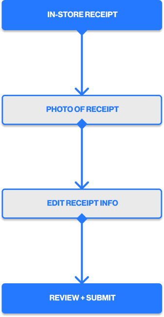
Using the four-step flow, a user can snap one photo of an itemized receipt and read a relatively predictable list of expenses. They may need to review or even edit the info, but not much else changes.
Capture Receipt → Extract Receipt Info → Review/Edit Info → Submit
B — Healthcare bills
Medical bills may seem as straightforward as receipts, but they actually introduce new complications, like:
Multiple pages
Additional receipt
Outstanding balances
C — Account information
Tangentially, users will need to fill out information that isn’t included in the document they submit to begin with. That includes information, like:
The user’s FSA administrator
Their subscriber information
Their dependent information



IV Final Thoughts
From a loosely defined idea to a working MVP.
Over roughly 3–4 months, we took FSA Simple from a loosely defined business concept to a working mobile application.
Our team:
Defined the major claim workflows
Created a complete mobile UX
Developed a working React Native application
Tested the experience with users
Submitted the application through Apple's testing process
The product ultimately never launched, but it doesn't change what the project accomplished from a product/design perspective.
We had taken an ambiguous, complicated problem and turned it into a functioning experience that could actually be used and tested.
Key Takeaways
Understand the system.
Break it into smaller pieces.
Solve the simplest valuable version first.
Introduce complexity only when it's necessary.
Build, test, and refine.
METRICS
© 2026 BEN NICHOLSON